

Submenus that work on a phone.
The problem: submenus in the core Navigation block are hard to open on small screens. Readers tap and nothing happens.
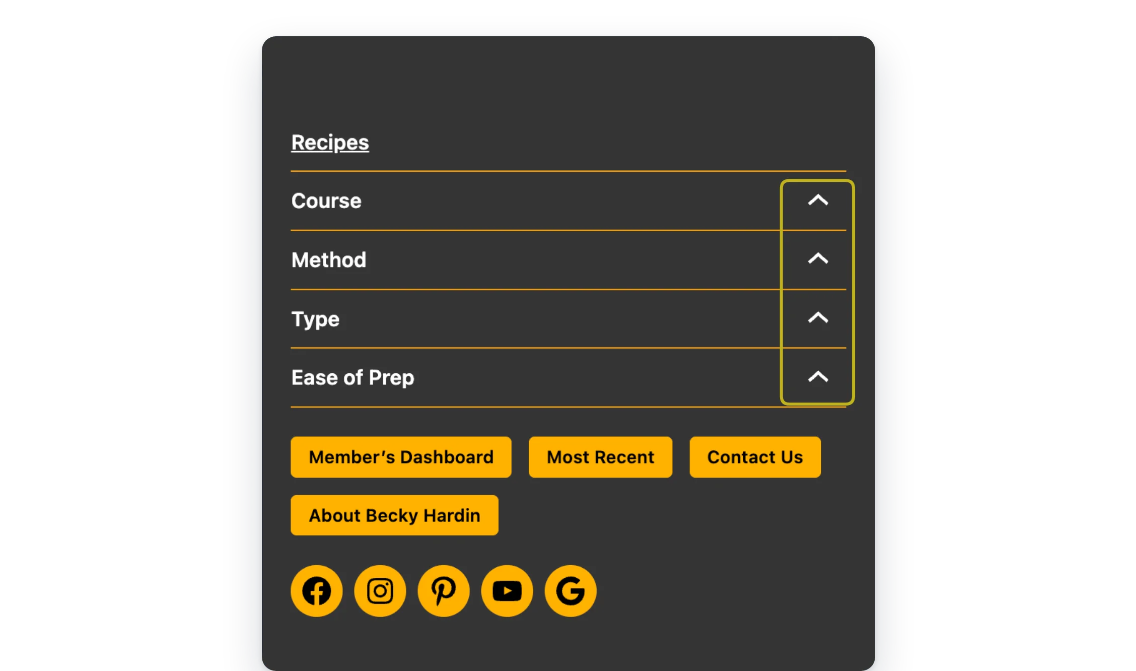
Navigation Block Controls turns submenus into tap-to-open dropdowns on small screens, with an arrow that flips when they’re open.
- Tap to open. Submenus open with a tap on phones.
- Clear arrows. The arrow flips when a submenu is open.
- Your theme’s look. Colors come from the Navigation block.
Free, all of it
Every feature is free. There’s no Pro version.
Screenshots
FAQ
Can I change the screen width where this kicks in?
Not from a setting. The tap behavior runs on screens 599px wide and below, which lines up with when the core Navigation block switches to its mobile menu by default.
Can I restyle the dropdowns?
Colors come from the Navigation block itself: set Submenu & overlay text and Submenu & overlay background in its Color settings. For anything else, use CSS. The plugin adds the class collapsible-active to a menu item while its submenu is open, so you can target open items in your theme or custom CSS.
Write a Review
You must log in to submit a review.