
Set columns per device with a slider.
The problem: a three-column grid that looks right on desktop is cramped on a phone. Fixing it means remembering CSS classes for every grid.
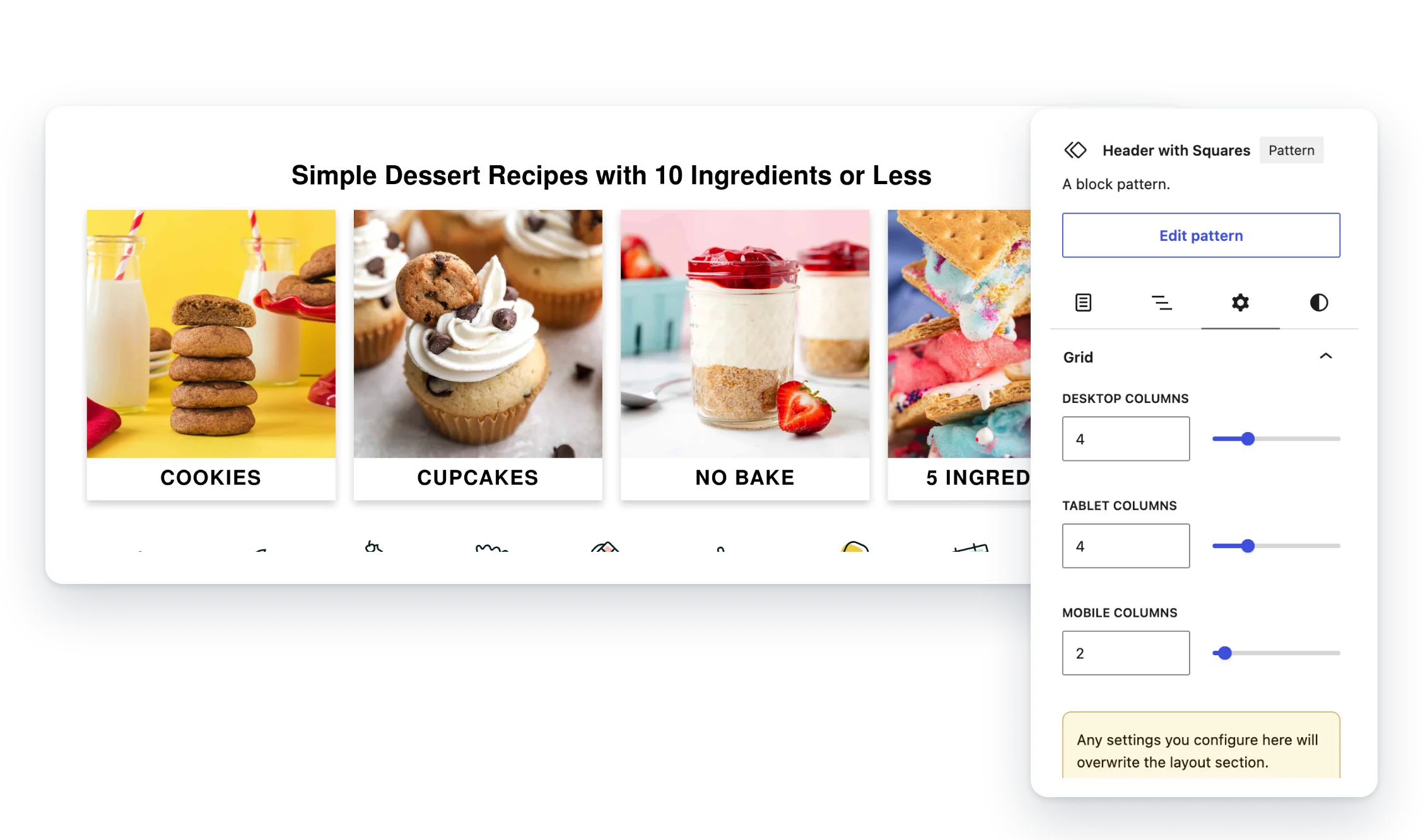
Grid Variation Options adds sliders to Group and Post Template grids, so you choose the columns for desktop, tablet and mobile.
- Three sliders. Desktop, tablet and mobile columns in the block sidebar.
- Groups and Query Loops. Works on Group blocks and Post Template grids.
- Classes if you want them. Use the CSS classes directly in your own patterns.
Included with membership
Members only. It comes with the Small Plugins membership, along with every other plugin.
Screenshots
FAQ
Does it work with Query Loops?
Yes. It works on Post Template blocks that use a grid layout, as well as Group blocks.
Do I need to know CSS?
No. Pick the columns with sliders in the block sidebar. The CSS classes are there if you’d rather use them.
Write a Review
You must log in to submit a review.