
Hide any block on any screen size.
The problem: a wide table that works on desktop breaks on a phone. Hiding it means remembering CSS classes or writing custom code.
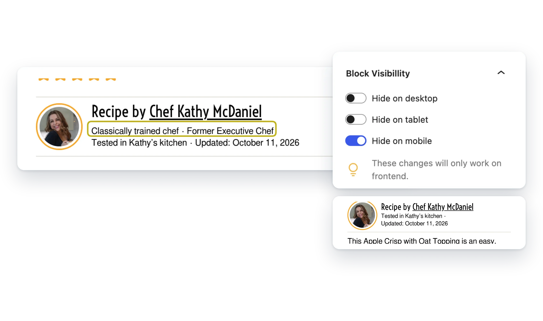
Turn on a toggle in the block sidebar, and Device Display for Blocks hides that block on desktop, tablet or mobile.
- Three toggles. Desktop, tablet and mobile, right in the block sidebar.
- Your breakpoints. Set what “tablet” means to match your theme.
- Any block. No CSS classes to remember.
Included with membership
Members only. It comes with the Small Plugins membership, along with every other plugin.
Screenshots
FAQ
How does it hide the block?
Each toggle adds a CSS class to the block (hide-on-desktop, hide-on-tablet or hide-on-mobile), and the plugin’s styles hide that block at the matching screen size. The block is still in the page’s HTML, just not shown.
My theme’s styles keep the block showing. What can I do?
The plugin also has stronger versions of each class: hide-on-desktop-important, hide-on-tablet-important and hide-on-mobile-important. Add one under Advanced → Additional CSS class(es) in the block sidebar. Changing the toggles afterward removes it, so re-add it if you switch them.
Who can change the breakpoints?
Administrators.
Write a Review
You must log in to submit a review.